Monday, May 2, 2011

Kate Shannon


Kate Shannon is a digital artist and photographer. She earned her undergraduate degree in Fine Arts in Photography from The University of Kentucky and her Master of Fine Arts Degree in Photography from Ohio State University. Kate is currently an assistant professor of Art at Ohio State University where she teaches digital imaging, photography, and multimedia courses. Some of Kate's accomplishments include The Ohio State University Mansfield Campus Excellence in Teaching Award in 2010 and her work has been on display most recently at the Marin Museum of Contemporary Art in the San Francisco Bay Area, the Woman Made Gallery in Chicago,and the 2010 Midwestern Society of Photographic Educator’s conference in Kalamazoo. 

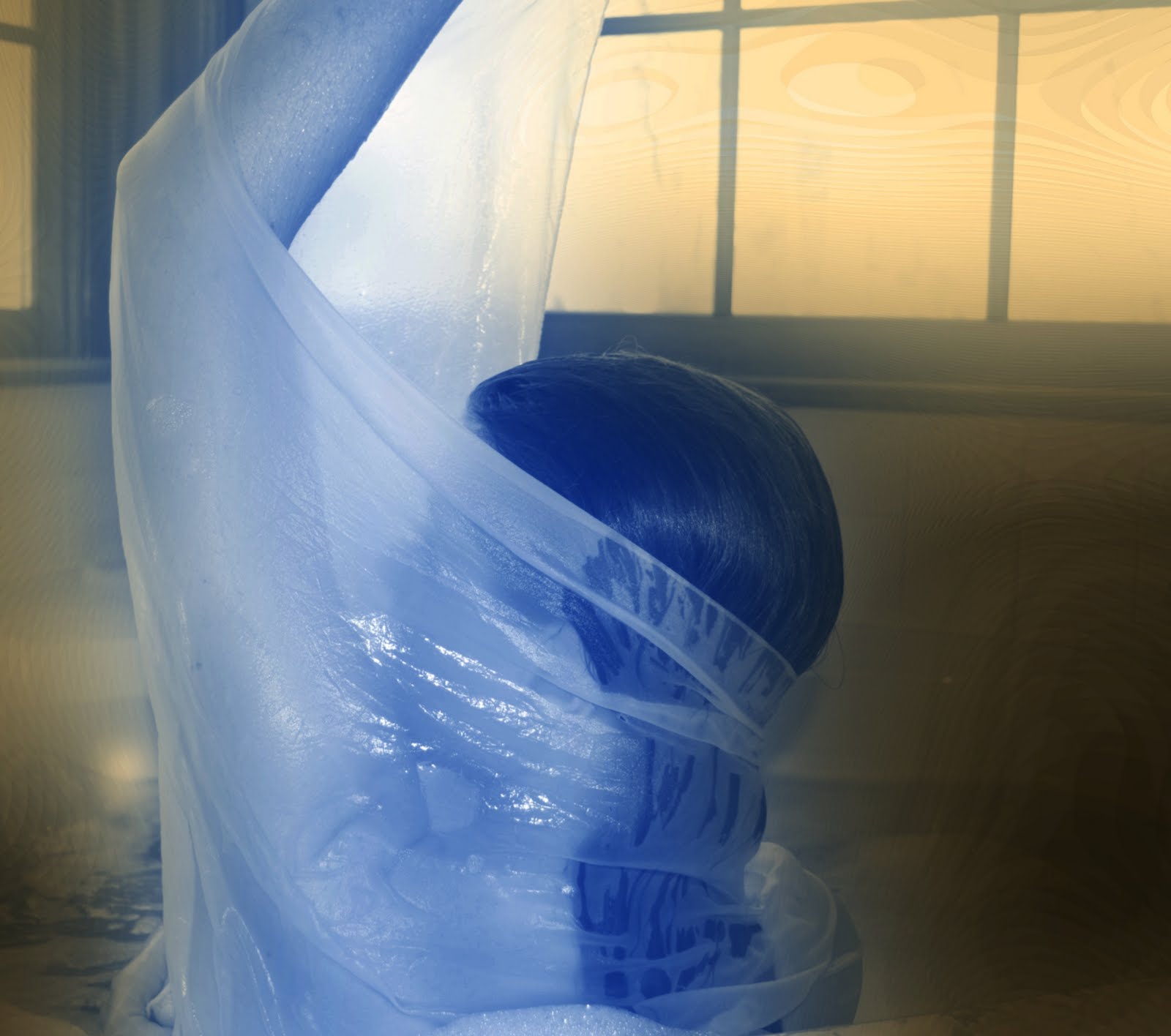
In her latest exhibition titled WhiteOuts from her series From within the happy crowd, Kate photographed various types of people at carnivals, fairs and amusement parks and then removed them from their background and replaced it with white. The subjects in these photos have varied placement within the picture plane and were all taken with a up looking perspective. The colors are very vivid especially because they have been removed from their busy backgrounds. 

Removing the subjects from their backgrounds creates a distant and disoriented feeling.  The people who would otherwise look very regular and natural in their own environment become completely different entities with only a white background as any sort of reference. Their facial expressions and almost blank stares create a mysterious relationship between the people and their surroundings. 

Her technical abilities in altering the photographs backgrounds is impeccable. When I first saw the series in the gallery before hearing of Kate's work in class, I had no idea how she made these images. Then when I saw the original photographs with their environments and learned Kate digitally separated the two layers I was completely impressed at her perfection and that she fooled me into thinking she had photographed these people in front of a white backdrop.

After reading her artist statement and some info about this series on Kate's website I realized that I was interrupting her vision completely wrong. These photographs capture peoples journey through life to find happiness. By removing the people from context it gives a more general feel and makes it easier to relater to one's own life. Kate does state that these are transitional moments and that these people are somewhat lost and this as well as the absence of any environment, may be why I felt uneasy when looking at them. 

Overall I am not really sure how I feel about this series of photographs. My first interpretation of Kate Shannon's concept and her actual intent were very different. I felt more anxious and curious by the white backgrounds and I did not really see "the pursuit of happiness". I do enjoy these photographs and I don't think I would change anything but I do perceive them very differently then Kate's original intent.   
  

Figure Study Inspiration and Ideas

For my final portfolio I want to explore more of the human form in a similar way as I did in my inspired by project. I really enjoy the way Man Ray as well as other photographers explore and abstract the body to create a commentary about the human condition.
Man Ray
                                                                      Anatomies 
                                                          1929

Lee Miller  
                                                                                      Forward Bend

Edward Weston
                                                     Nude 
                                                    1934


More from the greenhouse...


 One of my most favorite places to photograph is in the greenhouse on campus. I am constantly walking by and it is so nice and warm inside I cannot help but go in. I love photographing objects very close up and with an abstract or unusual view. Taking these photos really helped me to work out some ideas in my head about my upcoming portfolio of abstracted figure studies.    

Downtown Charleston, SC


Friday, April 29, 2011

Project 3 Panorama

This is a panorama made of photos taken of Folly Beach, SC using the Photomerge tool in Photoshop. I later added the surf shack and the doors to make it more surreal feeling. I am planning on going back and adding shadows under the doors to make it more hyper- real feeling.

Project 4 Inspired By...


These are the four photos that are inspired by the work of Man Ray. They are not as cohesive as a group as I had originally planned but I am still very happy with the final product.

Monday, April 18, 2011

Crosby Pier - Charleston, SC


I find that when I go on vacation or out somewhere I get so caught up that I forget to take photos. But on this trip to Charleston, SC for spring break I could not put my camera down. I love this old rickety pier and the big lazy pelicans just basking in the sun that didn't even notice we were there. 

Thursday, April 14, 2011

Inspired By Man Ray


Man Ray was an artist working in the early 20th century. He was American but worked mostly in Paris and his work is related with the Surrealist and Dada movements. Man Ray worked with many mediums such as painting, sculpture and photography.

In his photography, May Ray dealt with a variety of different subjects and presented them in an unusual and revolutionary way for his time. He pioneered the use of photo-grams in high art and even renamed them after him self: rayographs. Man Ray's black and white photographs are full of light and mystery. Man Ray shot some of his portraits in an editorial but still surreal and abstract style.

One of Man Ray's photos that I am most inspired by is from the July 1930 cover of "VU" entitled "The Tragic Necklace". It is a black and white photo of a barley dressed, reclined woman with a large snake around her neck.

This photo interests me because it is of a similar subject matter that I have photographed before but with a very different theme. This is more of an elegant beauty shot rather than one dealing with death and fear. I chose this photo to emulate because I would like to revisit the subject in a similar way.

A second photo of Man Ray's that inspired me is "Tears" from 1930. This is a very up close shot of a woman's face with very artificial tears rolling down her cheek.

I think it would be interesting to work with certain aspects of this photo like replacing the tears with diamonds or photographing some sort of transformation within a close up portrait, like hair turning into water.

The overall ideas that Man Ray most deals with in his photographs that I would like to work with are the surreal ways he photographs elements of the human form and how he captures and uses light to give his works an unearthly feel.         

Thursday, February 3, 2011

People-less Portraits

From People-less Portrait Series
April 2010

I want to explore and expand this idea of composing portraits of implied people by their scenarios and attire in the second project of warm and cool portraits. 

Tuesday, February 1, 2011

Ophelia

Ophelia
Gregory Credson
2001

I love the eerie over-saturation of the colors in this photograph. This is the one of the examples I had in mind when working on my non local color photo because the color saturation is right on the border of looking completely unrealistic and being too subtle.    

Friday, January 28, 2011

Tuesday, January 25, 2011

Non Local and Abstract Color


Liz Hickok
City Hall
2004
From San Francisco in Jell-O® 
Santa Fe Gallery


Liz Hickok's 2004 series, San Francisco in Jello, is a collection of photographs taken of a cityscape constructed in jello of San Francisco. The very odd and unrealistic angles of view in contrast with the realistic placement and proportions of the buildings creates drama and tension within the photos. One photo in particular, City Hall, shows a very lifelike replica of the building in red jello. The lighting also aids the low angle of view in creating drama within the composition. The red color choice maybe referring to Communism and the use of jello implies child-likeness or flaws withing the government. Non local or abstract color is distorting the natural or original color of an object, such as changing this white government building to red.